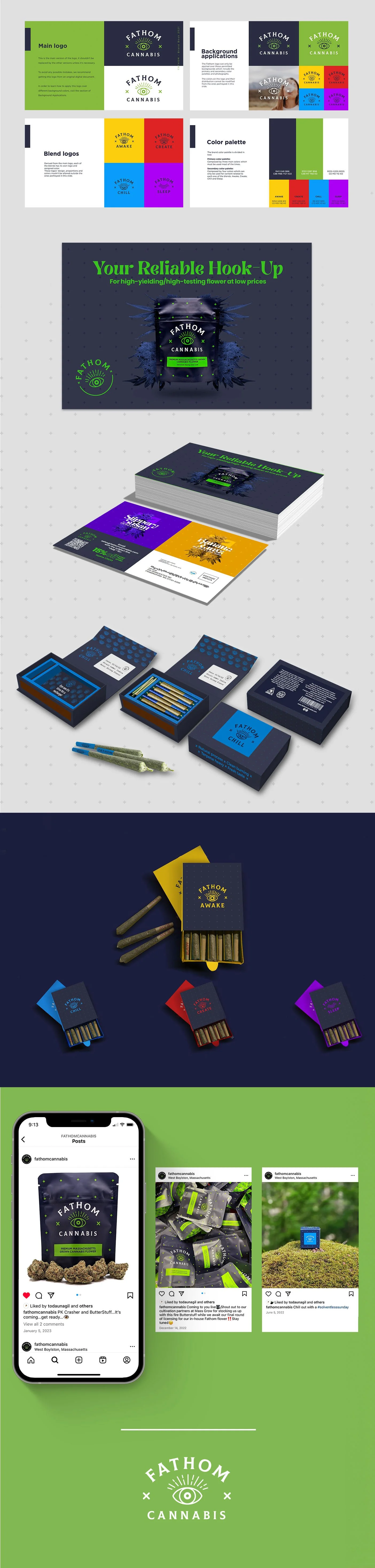
Fathom - Brand Redesign
Fathom, a sun grown cannabis company from Massachusetts, asked us to improve their logo, which was originally an abstraction of the Vitruvian Man, symbolizing the complexity of the interactions between the human body and cannabinoids.
We guided them through a co-creation process that ended up in a redesign of their whole branding ecosystem, to communicate this concept in a much more easy and fun way.
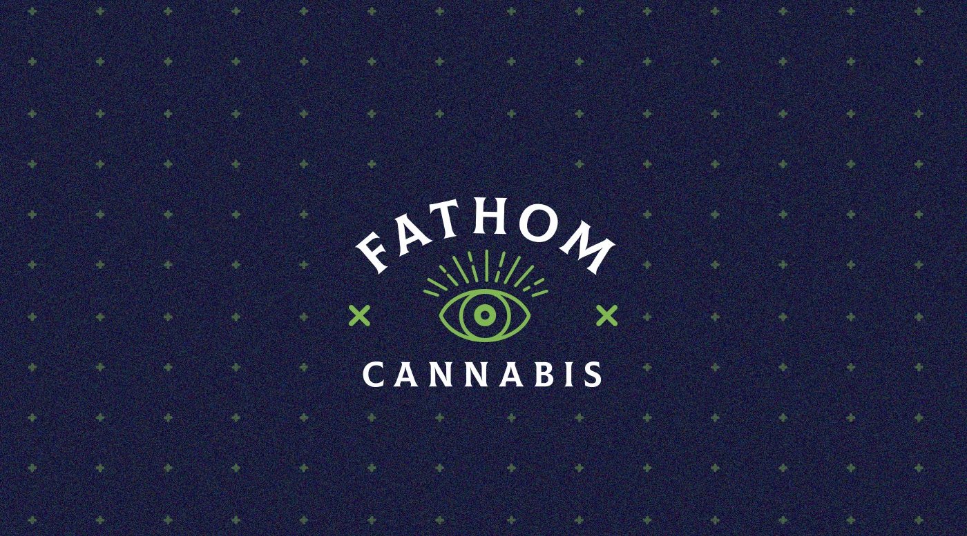
THE FATHOM EYES
We delved into the concept of “Fathom”, which means understanding something throughly, and we represented it through the eye.
The eye became the isotype and symbol of the brand, which we adapted to the four product lines of the brand that are derived from the blends: “Awake”, “Create”, “Chill”, and “Sleep”.